As a data scientist, I understand the critical role that Exploratory Data Analysis (EDA) plays in the process of turning raw data into actionable insights. EDA serves as the foundation upon which data-driven decisions are built, making it a fundamental step in any data analysis project. In this blog post, we'll explore the why, what, and how of EDA, using the versatile R programming language to uncover the hidden gems within our dataset. Let's dive in!
Why EDA Matters
A solid EDA is the compass that guides the data scientist through the tumultuous sea of raw data. It allows us to grasp the essence of our dataset, understand its nuances, and identify potential pitfalls early in the analysis. A well-executed EDA not only saves time but also mitigates the risks of making erroneous conclusions based on flawed data. Conversely, neglecting EDA can lead to costly errors, missed opportunities, and flawed models. Now, you might wonder, "Why R for EDA?" R is the perfect tool for the job because of its extensive libraries, packages, and its deep integration with data visualization tools. Plus, it's free and open-source. Now, let's get into the nitty-gritty of EDA.
What is Exploratory Data Analysis?
Exploratory Data Analysis is the process of examining a dataset to summarize its main characteristics, often employing graphical representations and statistical techniques. The main objectives are to understand the data's structure, detect anomalies, uncover patterns, and form hypotheses for further analysis.
The EDA Process: A Quick Overview
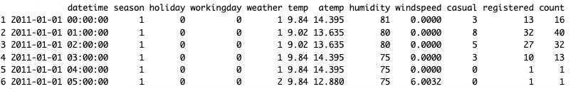
Step 1 – Observe your Dataset (High level overview)
Begin by loading your dataset into R and taking a preliminary look at its structure, dimensions, and the first few rows. This step gives you a bird's eye view of your data.
# Lodad libraries
library(tidyverse)
library(DataExplorer)

# Load the dataset
data <- read.csv("bike share.csv")

# Display the first few rows
head(data)
# Other ways to overview you data:
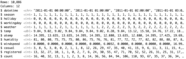
glimpse(data) # Lists the variable type of each column
skim(bike) # Another view of summary
summary(bike) # Produces result summaries of the results of various model fitting functions.
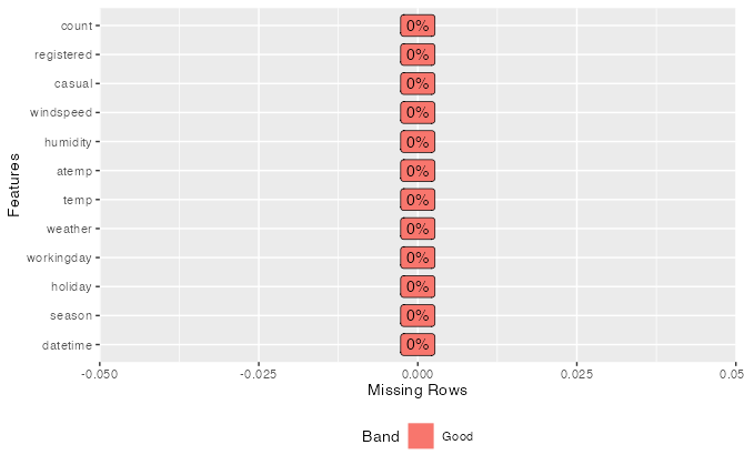
Step 2 - Find missing values
Identify and handle missing data to prevent inaccuracies and biases in your analysis. Visualizations like bar plots or heatmaps can be quite handy in spotting gaps in your data.
# Show the percent missing in each column
plot_missing(data)
Other ways to check for missing data:
# Check for missing values
missing_values <- sum(is.na(data))

# Create a bar plot
barplot(missing_values, names.arg = names(data), col = "skyblue", xlab = "Variables", ylab = "Missing Values")
Step 3 - Categorize Values
Distinguish between different types of variables - categorical (qualitative), continuous (quantitative), and discrete. This classification will inform if there is a need to change a variable type depending on your intent to use it, like changing a double to a factor or character to a double.
# Lists the variable type of each column
glimpse(data)
# Another way to check your data category
sapply(data, class)
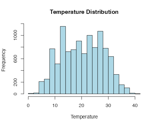
Step 4 – Find Shape of Dataset
Understanding the shape of your dataset is essential to help you choose the appropriate machine learning or statistical methods to use. The approach varies depending on the type of variable: categorical, continuous, or discrete. Let's explore how to visualize the distribution of these variable types using R.
For Continuous Variables: For continuous variables like temperature (temp), it's common to use histograms to visualize the distribution. Histograms divide the range of values into bins and display the frequency of data points within each bin. This helps you identify patterns and central tendencies.
# Plot a histogram for a continuous variable (e.g., 'temp')
hist(data$temp, col = "lightblue", main = "Temperature Distribution", xlab = "Temperature")
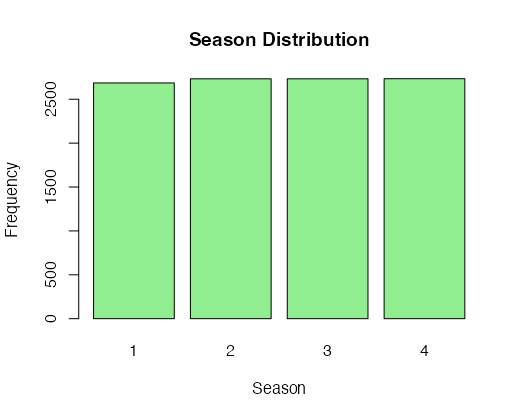
For Categorical Variables: Categorical variables, like 'season,' can be explored using bar plots. Bar plots display the frequency of each category, making it easier to understand the distribution of these variables.
# Create a bar plot for a categorical variable (e.g., 'season')
barplot(table(data$season), col = "lightgreen", main = "Season Distribution", xlab = "Season", ylab = "Frequency")
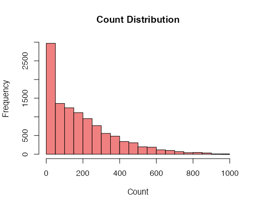
For Discrete Variables Discrete variables, such as 'count,' can also be visualized using histograms. However, you might want to customize the bin size to reflect the discrete nature of the data.
# Plot a histogram for a discrete variable (e.g., 'count')
hist(data$count, breaks = 20, col = "lightcoral", main = "Count Distribution", xlab = "Count")
Exploring the shape of your dataset for different variable types allows you to gain insights into the data's characteristics, whether it's continuous, categorical, or discrete. These visualizations help you understand the data's underlying patterns and guide your subsequent analyses.
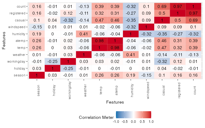
Step 5 – Identify Relationships in your dataset
Explore relationships between variables through scatter plots, correlation matrices, or other visualizations. This step is crucial for feature selection in predictive modeling. We usually compare the response variable with the explanatory variables, but also compare between explanatory variables to look for multicollinearity.
# Create a scatter plot to explore the relationship between 'temp' and 'count'
plot(data$temp, data$count, col = "blue", main = "Temperature vs. Count", xlab = "Temperature", ylab = "Count")
img src=”https://isaacaguilar97.github.io/my-blog/assets/images/scatter_plot.png” alt=”Show relationship between temp and coutn with scatter plot”/>
# correlation heat map between variables
plot_correlation(data)
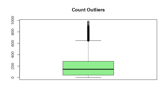
Step 6 - Locate Outliers
Spot anomalies that may affect the quality of your analysis by skewing the data and introducing bias to your future models. Tools like box plots, scatter plots, or z-score calculations can help in outlier detection.
# Create a box plot for 'count' to identify outliers
boxplot(data$count, col = "lightgreen", main = "Count Outliers")
Other ways to identify outliers:
hist(data$temp) # Histograms
qqnorm(data$temp) # QQ-plots

# Z-score or Standard score
z_scores <- scale(data$temp)
outliers <- which(abs(z_scores) > 2)

# IQR (Interquartile Range) Method
Q1 <- quantile(data$temp, 0.25)
Q3 <- quantile(data$temp, 0.75)
IQR <- Q3 - Q1
outliers <- which(data$temp > Q3 + 1.5 * IQR | data$temp< Q1 - 1.5 * IQR)
Clarifying EDA vs. Data Mining and Data Wrangling
EDA is often confused with data mining and data wrangling. Data mining focuses on discovering patterns and trends within data, often for predictive modeling. Data wrangling, on the other hand, is about data preparation, transformation, and feature engineering, often as a result of EDA findings. All three phases are interrelated, with EDA laying the initial groundwork.

EDA is Just Awesome!
In essence, a well-executed EDA streamlines the entire data analysis process, making it more efficient and reliable. It helps you uncover hidden insights, make informed decisions, and identify potential roadblocks before investing significant time and resources into modeling. The consequence of not conducting a comprehensive EDA can be costly and time-consuming, leading to unreliable results and incorrect conclusions.
In conclusion, Exploratory Data Analysis is the backbone of data science projects. Through the power of EDA with R, you've learned how to extract valuable insights, ensure data quality, and pave the way for effective data analysis. As you embark on your data science journey, remember the steps and techniques that have been covered in this article and make sure to practice them on sample datasets and other projects.
Happy exploring!